Department Store Germia
the story
The process of shaping the socialist consumerism in Yugoslavia started from the mid 1950s. By activating mechanisms of capitalism in a socialist political system, yugoslav politics encouraged the growth of a deep and complicated relationship with shopping, spending, acquiring and enjoying, creating this way a modern consumer society who enjoys entertainment.1
After the demolition of Prishtina’s bazaar during the 50s-60s, the traditional culture of trading was left behind and new contemporary forms of retail spaces were introduced. Modern retail stores with a new concept of consumption, where for the first time, the principle of self-service was experienced, were the nucleus of creating a consumer society. This way, the culture of trading in Prishtina experienced a total transformation in terms of forms of consuming and social demand, starting with the first self service supermarket in the 50s near Carshia Mosque. During the 60s it continued with a series of shops spread on the ground and first floor of a residential building on the south end of Marshal Tito Street today known as ‘the old department store’, following with the department store ‘Germia’ in the 70s.
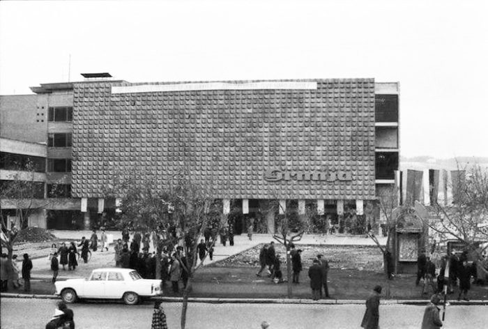
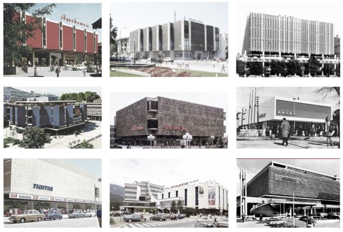
The Department Store Germia, was built in 1972 by the architect Lilijana Rasevski. Lying near the ruins of the old bazaar, almost in the borderline between the old city and the new modern structures, from its opening until the end of the 90s, the building was not only a place that offered a variety of goods, but also a venue, a place of exhibition and social interaction where purchase became a pleasure. During this period of time, almost every city in Yugoslavia owned a department store. They appeared as independent structures in main squares with well defined commercial structures, taking the role of the busiest urban spot and becoming a centralized attraction.
a modern hybrid
The original masterplan proposal in 1972 introduced the idea of a culture and art scene on the north and north-west surrounding the department store. A library, new theater with a theater promenade and a theater square, as well as an art gallery were seen in the masterplan but for unknown reasons they were never built.
The shopping complex was designed as a composition of four different shaped volumes, which were connected as a single unit, but still were operating independently hosting a program of an open sales area with the corresponding warehouse area, a self service restaurant and an administration building. Its openness towards the public space took advantage of the highly frequented location in the heart of the city, inviting a large number of consumers.
The entrances to the main sales area were set up in such a way that when a consumer entered the store, one had a clear overview of the free open space, where the escalator set in the middle would lead vertically through the building to the upper floors of retail space. Despite the escalator, the vertical
communication was achieved through one main staircase accessible for consumers, two additional staircases for the employees and the delivery, and an outdoor emergency staircase. Nevertheless, the escalator was the most important one, as it is said that it was the first one in the city making it to a true attraction. Everyone was talking about…the moving stairs!
The inner structure was made of a skeletal system with mushroom-shaped columns. The absence of walls in the main building offered a wide open space where goods were exhibited and intense social interaction found place.
The outer skin of the buildings was kept minimal. While the administrative, the restaurant and the warehouse building were designed using engraved concrete with linear textures and simple openings, the main focus lied on the sales building. The ground floor was transparent and the above lying volume of the main building was covered by a monumental facade of origami folded aluminium sheets and solid surface behind it without any opening. The four dark glass boxes on the angles allowed penetration of the daylight and offered a panorama view towards the public space.
For the city of Prishtina, department store Germia was not only a place to buy, it was an open cultural canvas that worked as a social condenser as well as a place for bespoke fashion and design. It was an experimental lab to establish a social interaction of the city and its urban context, a diverse collection of values and identities.
architecture on sale
After the Kosovo War of 1999, the status of The department store Germia, as many other buildings that hosted public facilities and used to be a social property, was undefined. The ownership of these public assets belonged to the Kosovo Privatization Agency and was undergoing the process of privatization. When the process took very long, these buildings were rented out to private investors or given for temporary use to governmental facilities until their status was solved. The former department store Germia was given for temporary use to some governmental facilities, and is now home of the Tax Administration of Kosovo.
Since there is no law to protect its architecture, the investors, who temporarily used these buildings applied harsh changes to adapt them to the new functions having no consideration for the architecture values they used to represent. When analyzing the current state of the former department store Germia, it seems like each department was totally free to ‘restyle’ the building.
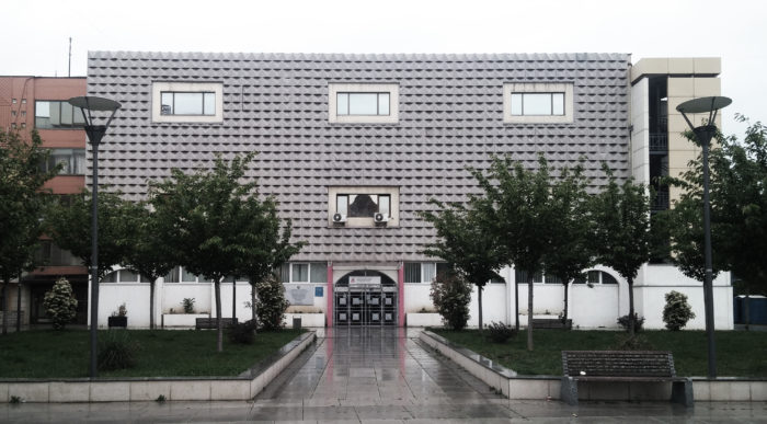
In the floor plan, most of the changes are to be seen in the former sales building. The escalator, that used to be the heart of the building, is locked up in the middle and the main staircase is not accessible on all the floors. The insensitive adaptation changed a lot of its outer image as well. Two of the buildings were painted in orange and the main building has fifteen openings even though the original design had foreseen a monumental facade with no windows. The four boxes are reduced to two and an additional emergency staircase was added on the front facade.
When talking about the loss of the city, it is less about architecture to be discussed as what really matters is the loss of public life and the social interaction. The back of the building is fenced and only a small part
of the building which serves as a reception is publicly accessible. This way, the architecture that used to host one of most vital social activities, today is an isolated island in the heart of the city.
tendency
There have been a few ideas about the future of what used to be department store Germia. Parameters like its central location, the highly frequented square on the front side, being next to the national theater as well as the significant active public life this building used to owe, are leading the discussion towards the idea of reactivation through culture.
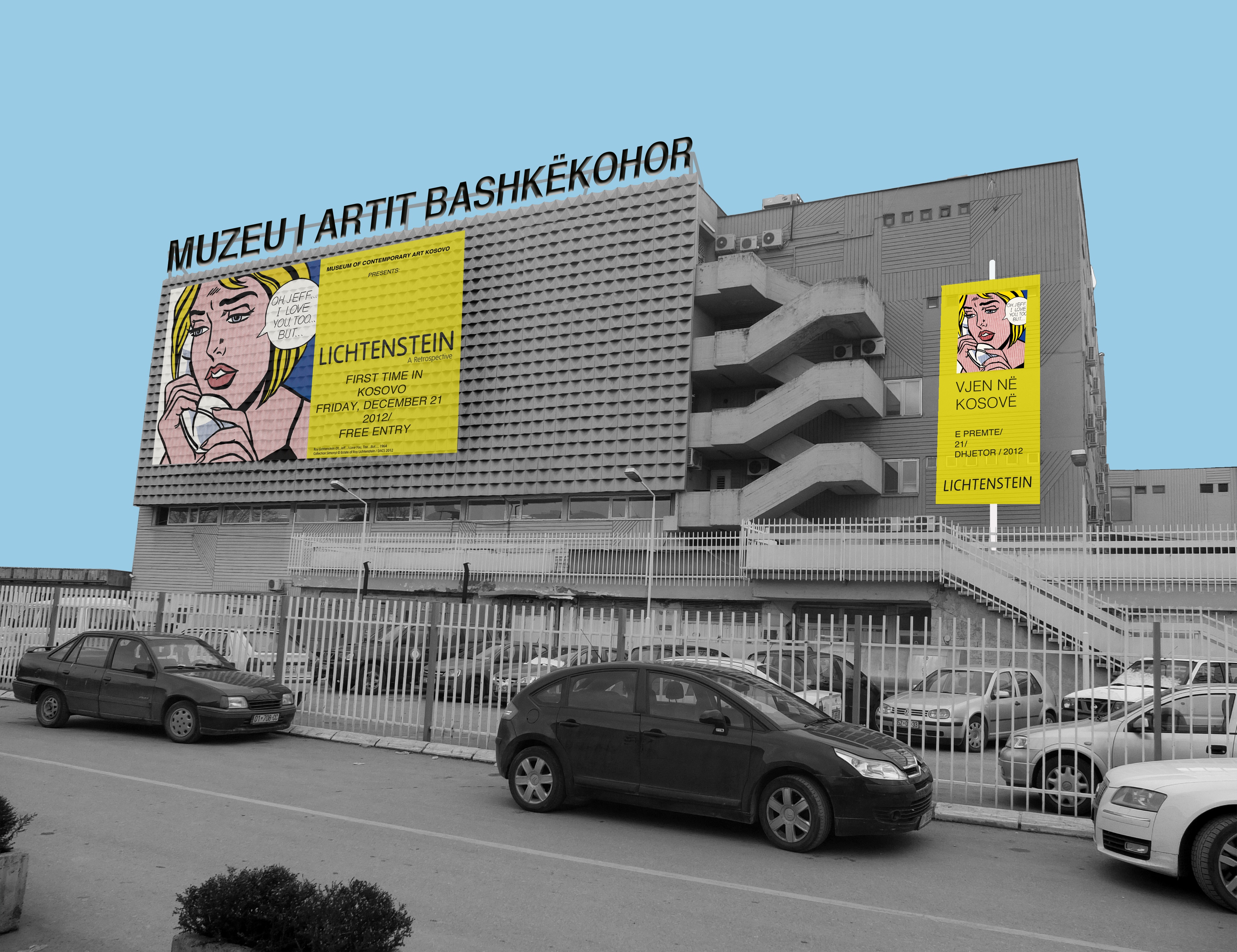
The starting point for the discussion was an article of a local political analyst, Shkelzen Maliqi in 2013 ’lets culturize politics’ published in a local magazine2, after the artistic community lost the battle to turn the former Hotel Union into a museum of contemporary art. The attention turned to the former department store Germia, calling it a good opportunity for the state of Kosovo to make a return to the arrogant attitude towards culture. Years later, Mayor Shpend Ahmeti promised in an election campaign the construction of a concert hall, where this building was proposed as a possible location. The debate reached its peak when the European Commission offered a 15million euro to fund the concert hall project, provided the project was in a suitable land on a landmark location. Considering the spatial requirements of a concert hall, it was clear that the building could not survive without major changes, so its demolition was also an option. Nonetheless, turning it into a museum would not require substantial changes as the building owns the proper layout and features for this typology.
This sparked controversy between artists and musicians, architects and urbanists, the municipality and the ministry of culture and led to a division in two groups: one group supporting the idea to tear the building down and build a new concert hall, and the other to protect it as a piece of cultural heritage and reuse it as a museum of contemporary art. A few organizations relevant for cultural heritage protection with the support of activists, architects and urban planners applied to the Ministry of Culture to include the former department store in the List of Cultural Heritage Assets under temporary protection. Also, an open petition was signed from more than 2800 people to enlist this building and protect it by law from its possible demolition, as one of the few remains of modernist architecture built during Yugoslavia.3
On Oct.10 2018, the building was included on a list for temporary protection4, guaranteeing its protection for one year, which marked a victory for the community who fought for it. Today, the owner of this building is the municipality of Prishtina. However, almost a year and a half after its temporary protection status, the discussion about the future of the former department store faded, leaving all options still open.
a vision
A typological transformative reuse of this building, found in an interesting and controversial social and political context, seeks to reveal its potential and architectural value. The project “Germia center for contemporary creation” was developed as a master thesis work at TU Graz, under the supervision of the architect Petra Petersson. It is by no means a solution but a mere reaction to the current state. It examines and argues the former department store, and its transformation into a center of contemporary creation, using architecture as an instrument to resolve a specific urban vision and reimagine the
relationship between the city, its past and art. Moreover, the attempt in this regard is to point to the power of architecture to tell a story and start a new dialectic in an existing context.

Germia center for contemporary creation
Based on an architectural and cultural analysis of the context, the typology research and the architectural relevance of the chosen building the project acts like a memorial of the existing and a celebration of the upcoming. Besides trying to discover the spatial qualities of the existing and to emphasize it affirmatively by reactivating the space through art, it shifts focus from being an isolated island inside the city to becoming a social centre of gravity. The project also attempts to provoke critical reflections on the socialist modernist heritage and provide a platform for further discussions for the acknowledgment of the architectural value of these buildings. The cultural regeneration of the former department store Germia provides the opportunity for the arts and the audience to coexist and play in an experimental ‘palace’ of contemporary art.
The architectural interventions are conceived as a dialogue between critical conservation, architectural experimentation in a specific context and enrichment of the current cultural infrastructure. One of the first and main ideas is the reach of openness and accessibility of the building from all the sides. As a reaction to the current state, aiming to expand the repertoire of spatial typologies in which art can be exhibited and achieve new connections the proposal foresees the demolition of one of the additional buildings in the south eastern wing. As a result, visual discontinuities are broken and the structures are no longer a hermetic heterotopia.
As an answer to the complexity of the transformation process the proposal also tends to regenerate the relationship of the building with the square by setting transparency on the ground floor. The public space as an urban interior, penetrates inside the building to promote a dialogue between internal and external space, unveiling the real substance of the building to the audience. Meantime on the backside of the building a contemporary garden is added to the urban fabric. The backyard in contrast to the crowded frontal square hides behind its walls and is quiet. It offers a space for outdoor exhibition, installation and above all a place for silence and reflection.
program
The transformative reuse to a center for contemporary creation, translates spatially the new program following the original use of each space. It aims to understand the complexity of the existing structures and to use the different spaces adapting to each of the activities that are able to enhance their individual spatial vocations. As a result the functions overlap with the initial ones and a new complementary relationship between consumption spaces and art spaces is established.
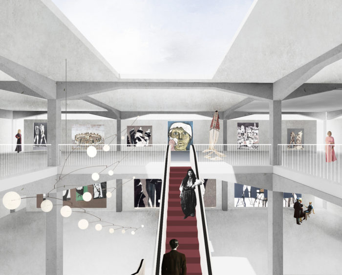
Due to the size, its bearing structure, the lightning conditions, its spatial qualities and above the fact that this structure used to host an exhibition already – the exhibition of goods, the project foresees this pavilion to rehost exhibition, this time displaying art. Drawing such parallels, the spatial essence of the building will be enhanced, reaching the original design matrices to propose them again in an interpretative way and reestablish the relationship between architecture and its context.
The south-western wing of the complex works partly as a support for the house of exhibition, partly independent from the rest of the structures. The six story high building aligned with the buildings along the boulevard, houses artist studios/ateliers, temporary residence and administration, providing this way a space of cultural production. The artist ateliers, reduced to 5x5m squares offer intimacy and coexistence enhancing the art studio and its aura as the ultimate site of creation.
This way, the architecture becomes the frame for artwork and culture activities, allowing art to express its own independent voice and grow inside the house.
spatial sequence
Shell. Slice.Slot.
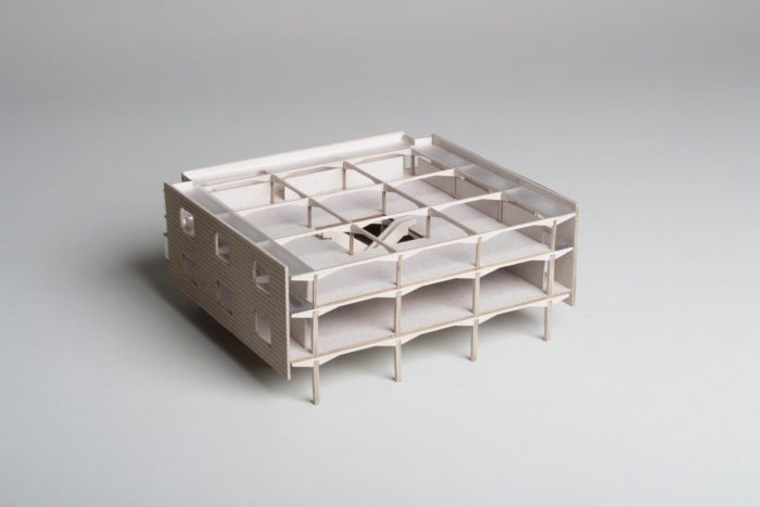
Especially challenging during the design process was dealing with the existing facade. Despite the monumentality of the original design as a department store, the after-war transformative reuse changed the architectural image of the complex in an irreversible way. However, the present-day facade shows not only the history of the building itself, but is at the same time a mirror and a reflection of the history of the city. Instead of a direct intervention in the outer skin, the typological transformation foresees a less visible intervention. A second shell, like an offset of the outer skin contour, takes place on the inside of the building and creates a closed exhibition area, keeping a certain distance from the existing structure. The in-between zone acts like a light filter and orchestrates the rays of daylight throughout the house. It becomes the buffer between the interior and the city and allows the visitor to escape the exhibition space offering a place to create a visual connection with the city. This way, the lively public space in front of the building becomes the exhibition, displaying the life of the city framed through the openings of the existing facade.
Stacked Enfilade. Cut Out
The absence of walls and the intention to create wide free spaces for the exhibition, meant leaving the horizontal sequence, the classical enfilade. Instead, the exhibition area consists of vertically stacked galleries but the principle of walking through was preserved due to the floating vertical circulation – the escalator.
In order to enhance the central escalator as a fluid vertical communication and reestablish its relation to the city two cutouts on each side of the escalator are made on the ceiling. The openings in the floor create triple height space for the lobby, allowing extra large sculptures to be displayed and refine the escalator experience. This way, the escalator becomes the beating heart of the building.
the challenge of change
Thus, this is the juncture when architecture suddenly assumes the quality of a player, of something that rewrites the palimpsest. With a fictive architecture scenography, the design juxtaposes in the project three conditions – the use, reuse and transformation in a state of permanent interaction offering an ensemble of fragments congealed into a single image. In this respect, a paradigm shift emerges. The architecture that
was born to cover the city’s deepest roots, embraces the past and becomes an active urban actor, generating a series of relationships between different actors and interconnected narratives.
Endnotes
1. Pattrick Hyder Patterson, Bought & Sold – Living and Losing the Good life in socialist Yugoslavia, (Ithaca: Cornell University Press, 2011) 2.
2. Shkelzen Maliqi, Shqiptarja Homepage, 27 March 2013
3. Cristina Marí, Kosovo 2.0 online magazine, 24 October 2018
4. Homepage of the Ministry of Culture, Youth and Sport, 10 October 2018
Donika Luzhnica, born in 1991 in Suhareka, is an architect based in Zurich and Prishtina. She is currently holding a position as a design architect at CH Architekten in Zurich. In 2018 she obtained the Master Degree from the Technical University in Graz and her Master’s Thesis – “Gërmia center for contemporary creation. Reimagine the relationship between the city, its past and art”- was nominated at GAD Awards and won the third Prize.
During her studies, she has been working as a research and student assistant at the KOEN Insitute at TU Graz and has as well collected experiences working with various practices, LOVE Architecture and Pittino & Ortner amongst other, for many project related collaborations.
In 2016, together with three other colleagues, she has won the first prize in a realisation competition “Revitalisation of steps in Arberia Quarter and construction of a new pedestrian bridge” and co-founded ARS Atelie – an interdisciplinary architectural practice based in Prishtina later that same year.
In 2018 she has been part of the design team of the Kosovo Pavilion at the 16th Architecture Biennale in Venice.
Her work focuses on typology research and design.